Statistical models for stock prediction

A moving average follows the price. A trend line does something bolder: it draws one straight line through the whole history and uses its direction to guess the future. To pick the best line, we need a way to score how wrong a line is. That score, the error, is the most important idea in this whole course.
A line is a tiny prediction machine
A straight line through the prices is just a rule: pick a starting height and a daily step. Give it a day number and it hands back a predicted price.
Here \(t\) is the day number (day 0, day 1, day 2...), \(a\) is where the line starts, and \(b\) is how much it climbs per day. The little hat on \(\hat{p}\) means "predicted price," to keep it separate from the real one. For NCB, a good line rises by roughly J$1 per trading day. To predict next Tuesday, you just plug in its day number.
How wrong is a prediction? Meet error
For each day, the line predicts a price and the market gives the real one. The gap between them is the residual. A good line makes all the residuals small. We roll them into one number two common ways:
MAE (mean absolute error) is the plain average gap, in dollars. Easy to read: "on average we are off by J$1.40." RMSE squares the gaps first, so a few big misses hurt much more than many tiny ones. Both are in Jamaican dollars, and for both, smaller is better.
How to use this lab
- Move the start and step per day sliders to drag your line through the real prices.
- The coral dashes are the residuals, the gap between your line and each real price. Shrink them.
- Watch the MAE and RMSE fall as your line fits better. Then press Snap to best fit to see the line that makes them as small as possible.
- Read your line's forecast for Tuesday (two trading days after the last real price).
Where the straight line breaks
Snap to the best fit and look closely. The line captures the overall climb, but NCB shot up sharply in the last few days and the straight line cannot bend to follow. That is the weakness of a pure trend line: it assumes the future keeps the same slope forever. Real prices speed up, slow down, and reverse.
Trend-followers bet the line keeps going. Mean-reversion traders bet the opposite: that a price which has run far above its recent average is "stretched" and likely to snap back toward it. Both can be right at different times, which is exactly why no single simple rule wins forever, and why we bring in machine learning next.
The three statistical models the pros use
Everything so far belongs to a family called statistical models: they read the price history and use straightforward maths, with no feature-training required. Three of them show up again and again on real trading desks.
You already built the first two. The third, ARIMA (its close cousins are the exponential-smoothing models), is the classic time-series workhorse: it forecasts the next price from a blend of the recent prices and the recent mistakes it made, automatically balancing trend-following against mean-reversion. All three are quick, need little data, and are easy to explain to a boss, which is exactly why banks still lean on them.
Try each model yourself
Each model now has its own hands-on deep dive: a plain-words explanation, a game you can play, and a live chart on real NCB data. Work through all three, then come back here.
 Moving averageSlide the window and watch it smooth the noise.Open the interactive →
 Linear regressionDrag your own best-fit line through the prices.Open the interactive →
 ARIMADifference the data flat, then forecast momentum.Open the interactive →
Read the chart like an analyst
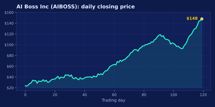
Before any model runs, you have to read a price chart by eye. Here is about one year of a different company, AI Boss Inc (ticker AIBOSS), simulated so we can talk about it freely. Study the shape, then answer.
- A trend line \(\hat{p} = a + b \cdot t\) predicts a price from the day number.
- The residual is the gap between the real and predicted price.
- MAE is the average gap in dollars; RMSE squares first, so big misses hurt more. Smaller is better.
- The best fit is the line that makes the error as small as possible, but a straight line still cannot bend with the market.
Next: give the computer many clues at once and let it learn, machine learning.